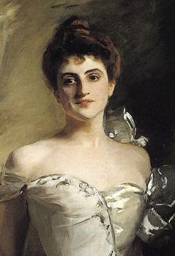
Last week, we did a ten-minute exercise with a painting by John Singer Sargent, one of the most famous portrait artists of his time. It’s “Mrs. Ralph Curtis” or “Lisa Colt Curtis,” and is my favorite painting in the Cleveland Museum of Art.

I hope you took the opportunity to look at this for ten uninterrupted minutes. What struck me immediately the first time I saw this painting was, unsurprisingly, her face. It’s not that it’s pretty (although it is), but that it’s so unreadable. Or maybe that it’s too readable: there are so many ways to read her expression. Is she smiling in happiness to see someone? Or is she greeting guests as they file in for a dinner party? (She was in a wealthy family and this is from the late 19th century, so this sort of thing still happened then.) Or is she tired and forcing a smile as the guests leave? Is she even smiling at all?

The meaning of her expression can change from day to day or from minute to minute. Is she lost in thought? Listening politely to boring conversation? Listening covertly to a conversation in the other room? It could be any of these things or a thousand others, and that’s what I like most about this entire painting. In the novel that’s coming out in the fall, one of the characters is given a fictional Monet as a gift. Although I wasn’t thinking of this particular painting when I wrote it, I was describing the effect this one has on me when I wrote her excitement about it:
“I used to go to this small gallery when I was a little girl and stare at this for as long as my parents would let me. I loved the birds over the water. I wondered what it would be like to be one of them, free to fly wherever I wanted. I thought that if I was over a pretty little lake like that, I’d fly circles over and over it until my wings got tired, then I’d land next to that little girl and keep her company. I would stand there and wonder what was going through her head as she looked at those flowers. Some days, I would give her sad thoughts. Some days, I would give her happy thoughts. She had so many stories.”
Another one of the things I like most about the painting is the detail put into her eyes. Although I do write long books, I put a lot of effort into making each word count. One thing I do when I’m revising my work is to ask myself, “What if this wasn’t in here? Would that make it better or worse?” This works with paintings too, so look at the small white detail he put into her irises and ask that question. Here, I think the answer is obviously that those two tiny white flecks at the top right of each of her eyes must be there. They’re so natural they may be hard to notice at first glance, which ironically often is a way something advertises its indispensability.
Other things you may have noticed are that her dress seems to be made up of two different dresses joined together. Her right side (the viewer’s left) has an unadorned off-the-shoulder sleeve, whereas the opposite side has a shinier bust with large bows. Her dress is almost as much of a chimera as her expression.
Although I’ve loved this painting for years, I spent ten minutes with it for this exercise and found some new things in it. I’ll start with the obvious one, which both stuns me that I never noticed it before and is something that now that I’ve seen it, I can’t unsee it. Her right hand (on the viewer’s left) isn’t painted in detail; in fact, the fingers are so blurred this looks like a 21st century AI mistake. I couldn’t believe I’ve never noticed this before, so I went over to my reproduction, which is almost four feet high and on actual canvas (it’s not a poster print, and it wasn’t cheap). Although four feet is half the size of the real one (Sargent’s painting of her over eight feet tall, so it’s actually bigger than she is!), the blurriness isn’t as obvious, and comes across more as softness than overt lack of detail. (This is why we need to go out into the real world and look at actual paintings sometimes.)

Another thing I hadn’t noticed before is the side of the table on the right side of the painting. Look at how his lack of paint along the edge on the far side of it adds to the illusion of depth:

While you’re looking at that, check out the brushstroke that looks like a Nike swoosh and adds another layer to her dress with almost minimal effort.
The final thing I’ll leave you with that I noticed this time but not all the times before is how she’s aligned in the painting. One of the things I’ve always loved about this work is the curvature. There’s such a soft arc to it, but I never noticed that she’s balanced almost exactly on her left foot. Here’s a plumb line to show how almost perfect it is:

There are plenty of things left for you to have seen. The comments section is the perfect place for your take on it!
I'd love to hear from you!